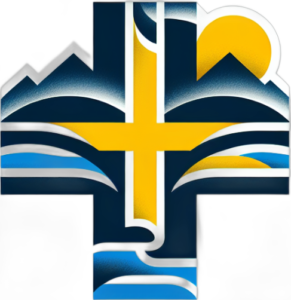
With a new website came the possibility of a New Logo. Hopefully you can see a connection between the logo and who we are as a church based in Central Otago.

Narrative about the Logo:
No matter where we are in the parish From Clyde to Alexandra and stretching out to Lauder the hills are ever present, leading our eyes sky ward, echoing the line from Psalm 121
I lift up my eyes to the mountains—where does my help come from?
My help comes from the Lord, the Maker of heaven and earth.
The dual Yellow and Blue toning reflects two things: Our heritage of our two churches Methodist and Presbyterian, and of course we are located in Otago, highlanders country.
The rivers again are about place, the Mighty Clutha Mata-au and the Manuherikia, both vitally important for our communities. This is echoed in Psalm 104:10. The rivers are flowing and have taken on a subtle stylized shape of Koru, a recognition that we are located on the whenua (land) of Aotearoa.
“He makes springs pour water into the ravines; it flows between the mountains.”
The Cross of our faith is Central to the Logo. And a rising Sun speaks of two things again of Central, the hottest and driest place in New Zealand, and also a reminder of God and our role in praising God. Psalm 113:3.
“From the rising of the sun to its setting, the name of the Lord is to be praised!”

